Monday 12 August 2013

The road not taken

I recently changed the route of my cycle commute into central London, trading a longer journey (about five minutes more) for a cleaner, safer and less stressful one. The downside is it takes me half a mile and about five minutes more to get to work, but by going over Southwark instead of London Bridge the upside is I'm less likely to be crushed by a truck or get respiratory problems from the air around Bank.

Cyclists make these kinds of calculation all the time. They take quiet back streets to avoid dangerous main roads, they dismount and cross at pedestrian signals rather than try to turn right across moving traffic, and so on. There are a number of daredevils who take the most direct route to where they're going regardless of the conditions, but in my experience almost everyone who cycles accepts some kind of delay or diversion in exchange for extra safety, comfort or peace of mind.

But that's just the people who cycle, and in Britain they are relatively few in number. Most people don't cycle, presumably because they don't think it worth their while. On the face of it this is a puzzle, since cycling can be faster than driving or other modes of transport in many contexts. But the reality is that this speed advantage can be wiped out if you have to make too many of these delays and diversions to make the trip acceptable by bike. If people have to go around the houses to feel safe on a bike, many of them will just take the car instead.

The flip-side is that if we can make the quick and direct routes safe and comfortable to cycle, then many people will find that cycling suddenly makese sense for them. This is what happens in the Netherlands, where people are not expected to either brave unpleasant conditions on main roads or work out a convoluted but quiet route on back roads. By making cycling safer, they have made it quicker too, and that's the key.

Evidence on how far people will go out of their way to avoid unpleasant or dangerous roads has long been one of the missing pieces in understanding the choice of whether or not to cycle. If we knew how much time people would give up to avoid a bad junction, we can guess how much time we could save them by making it safe and pleasant to cycle through, and then estimate the impact on cycling's local mode share, traffic congestion and so on. These factors are key to the kind of economic analysis which determines how transport funding gets spent and which has so far more or less ignored cycling.

So this research into cyclists' route choices carried out for TfL by Steer Davies Gleave could be very important, because it tries to answer exactly these questions. They asked people (mostly people who cycle in London) to rate the attractiveness of different types of junction types and cycling conditions, and crucially it asks them how much time they would be willing to add to their journey to avoid particular situations.

Here are some of the results. First, the extent to which people agreed with various statements about route choice, by their frequency of cycling, age and gender.


The first thing to note is how many people, even frequent cyclists, agree with statements like "If I had to negotiate a number of difficult junctions I would try to find another route" and "I would prefer cycling in a cycle lane which is separate from the traffic even if it meant a longer journey". But the different average responses by gender are striking too: women seem significantly more likely to change their routes due to safety concerns than men, consistent with findings from the British Social Attitudes survey showing women are more likely to think the roads are too dangerous to cycle. Finally, long-term cyclists (those with more than two years experience) are consistently more willing to endure bad conditions in exchange for a quicker journey than inexperienced ones. There is probably a learning or hardening effect here, with people becoming more skilled or better able to cope with unpleasant conditions over time - but there is undoubtedly a selection effect too, with many people trying out cycling but not keeping it up due to safety issues. Experienced cyclists constitute the small minority of people who are willing and able to deal with the problems posed by cycling on British roads.

The researchers also asked people to rate how safe they felt cycling through different types of junctions.


Here, the striking thing is how unsafe people (mostly cyclists, bear in mind) think fairly common junction types are. The very first junction in my five-mile commute to work is a right turn from a side road onto a main road, and it's not very nice: I have to wait for a suitable gap in the streams of traffic and then dart into it at a decent speed. Clearly for many people this would be one junction too far and the journey as a whole would be unviable by bike.

The next charts illustrate how important this all is.


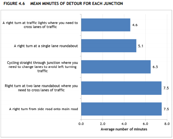
A majority of people said they were willing to accept a detour of over five minutes to avoid a right turn at a two-lane roundabout, or a right turn from a side road to a main road. The average was 7.5 minutes. These are very big figures, surprisingly big to me at first - but I'm an experienced, battle hardened cyclist, and as I said at the start I still make detours, though maybe not as big.

It's worth emphasising again that these kinds of results go a long way towards explaining why more people don't cycle in Britain. It's because our main roads are so dangerous and unpleasant to cycle on that people would rather sacrifice huge chunks of time than do so, to the extent that cycling is for most purposes no longer worthwhile.

Finally, the researchers asked people to compare different types of cycling facility. The chart below shows the average benefits people ascribed to each type of facility, with the most popular (off-road routes) set at 100.


The key result here is that there is a big preference for off-road cycling infrastructure as compared to bus lanes, advisory cycle lanes or mandatory cycle lanes, particularly among women. In comparison, the type of road doesn't seem to matter very much.

This certainly looks like a big win for segregated bike lanes (consistent with lots of other evidence on the subject), but it's worth bearing in mind that the picture of an 'off-road' route people were prompted with (below) looks more like a route through a park than a typical segregated track alongside a main road, and that has probably affected the results somewhat.

This is very valuable research because it starts to quantify the extent to which our current road designs fail people and prevent cycling from becoming a mainstream choice, and because it can also help us quantify the benefits of better infrastructure. It deserves to be read widely, by both campaigners and planners.

Monday 29 July 2013

Quantifying the costs of road casualties in London, by borough and mode of transport

Injuries and deaths as a result of road collisions impose huge costs on our society, both on the people directly involved and an others more indirectly affected. While everyone will react differently to being in a road collision, we can try to quantify the average social and economic impacts in order to get at the overall cost to society as a whole and hopefully provide a further incentive for change.

The Department for Transport estimates the total cost of a road fatality to be around £1.7 million, of a serious casualty around £190,000, and of a slight casualty around £15,000. These are arrived at using the 'willingness to pay' economic method, and are meant to take into account the 'human costs' of suffering and grief, lost economic output due to injury or death and the costs of medical treatment.

Using these figures DfT estimates the total cost of reported road casualties in Britain in 2001 to be around £15.6 billion, and the total cost including unreported casualties to be up to around £34.8 billion.

Using the same average costs, Transport for London estimates the total cost of reported road casualties in London in 2011 to be around £2.35 billion. Since TfL also provide data on the location, mode and severity of each casualty in London in 2012, we can use the same figures to see how these costs vary from borough to borough and mode to mode.

The chart below shows the estimated total social and economic cost of reported road casualties in 2012 by borough and the casualty's mode of transport, using DfT's averages. There's a table with the same figures below the fold.


There are huge variations between boroughs in terms of both the scale and the composition of the costs associated with road casualties. The total cost in lowest in Kingston at around £27 million, and highest in Westminster at around £128 million. In Outer London boroughs car occupants account for a higher proportion of casualties and therefore of costs, while in some Inner London boroughs pedestrians and cyclists account for over half the costs, reaching 58% of the total in Westminster and 69% in the City of London. Across all boroughs the total costs by mode come to £523m for pedestrians, £345m for cyclists, £674m for car occupants and £518m for other modes (motorcycles, buses, taxis, goods vehicles, etc).

It's worth emphasising that these figures are bound to be an underestimate. Not only do they cover only reported casualties and excluse those that go unreported, but they arguably don't capture the full range of costs. Road danger results in 'avertive' behaviour, where people go out of their way to avoid particular danger-spots or choose to take modes of transport which are safer but slower or more expensive. These costs are very difficult to quantify and so they aren't included in the DfT figures.

Also, the average costs per casualty are likely to be higher in London than in other parts of the country, given the higher wages in London and therefore higher costs of lost output and higher 'willingness to pay' to avoid casualties.

It may sound callous to talk about road casualties in terms of money but this is really just a way to try and quantify the non-monetary costs in a rigorous way. And I think these figures could be a useful tool for campaigners too. Some boroughs don't seem to attach enough importance to road safety (or road danger reduction, if you prefer), but if the government were to levy fines on them in proportion to these costs I think it would concentrate minds pretty rapidly.

Wednesday 17 July 2013

London shows you don't need new roads to tackle congestion

The Department for Transport has released traffic forecasts which, like Department for Transport forecasts always do, predict huge increases in traffic over the coming decades.


The first thing to say about these is that if they are anything like as accurate as previous DfT forecasts, the actual trend in traffic will be much lower.

The other interesting thing is the section where DfT's forecasters try to explain why they got the London traffic trend so completely wrong (they forecast a drop of 1.5% between 2003 and 2010 but the actual drop was 7.8%, despite the population growing faster than anyone thought). They say:
We believe that the reason for this short-term model error and long-run discrepancy with other forecasts is due to: 
Car Ownership – the number of cars per person in London has been relatively flat over the last decade. While we have different car ownership saturation levels for different area types, including London, these may need to be re-estimated. 
Public Transport - London has seen high levels of investment in public transport, capacity and quality improvement on buses and rail based public transport. London will continue to see high levels of investment in public transport with increase in capacity into the future, e.g. Cross Rail. We will need to revisit our modelling on the impact this may have on car travel. 
Road capacity, car parking space cost and availability – There is evidence to suggest that In recent years London road capacity has been significantly reduced due to bus lanes, congestion charge and other road works. There is also a significant constraint and cost to parking in London which would reduce the demand to travel by car. We will need to revisit our modelling on the impact this may have on car travel. 
In other words, London's experience shows that investment in public transport, congestion charging and road diets will reduce traffic sharply, which in most cases would remove the need for any new road building.

So why are the government doing the opposite of what London did and plowing ahead with lots of road building? Who knows, but my hunch is that government ministers aren't actually interested in reducing congestion. After all, going by their actions the Conservatives' long-term strategy on this issue seems to be to let congestion and rise and then attack Labour for trying to address it with road-pricing. I've no doubt this is a succesful strategy in political terms, but it's terrible for the country as a whole.

Monday 1 July 2013

Trends in London cycling casualties

Last Friday Transport for London released statistics on London's recorded road casualties in 2012, along with (for the first time) some useful raw data - see under 'Data extracts' here. I've used the new figures to update some long-term trends in cycling casualties in London. Unfortunately they don't make for cheerful reading.

The first chart shows the trend in total recorded cycling casualties, split into slightly injured and killed or seriously injured ('KSI', in the rather inadequate jargon). As you can see, total casualties peaked in the early and late 1980s, fell fairly steadily in the early years of this century but rose again from about 2007, reaching just over 4,600 in 2012.


The large number of slight casualties hides the trend in fatl or serious casualties so the next chart isolates those. It show a slightly different trend, peaking in 1989 at almost 800 a year and with a sharp increase in the last few years to 671 in 2012.


These trends are pretty grim for cyclists, which as the chart below shows have comprised a seemingly ever-increasing share of London's fatal or serious road casualties over the last decade, reaching a fairly shocking 22% in 2012. Maybe instead of asking that cyclists get a share of investment equal to their mode share (around 2%) we should be demanding they get the same as their share of casualties?


Finally, let's have a look at cycling in the City of London, the tiny square mile at the heart of London which so many of us have to cycle through even if the people who run the place would rather we didn't. The first chart here shows a rising trend in total cycling casualties in the City since 1986.


And the second chart shows the trend in fatal or serious cycling casualties.


It should be fairly clear that the City has a big problem with cycling safety. Bear in mind that its Local Implementation Plan sets a target to reduce the number of fatal or serious casualties (of any type) to a yearly average of 39 by 2013 (4.54 here). But instead the trend is going in the opposite direction, with 49 killed or seriously injured in 2011 and 58 in 2012. As the chart above shows, cycling accounts for much of this increase, so maybe the City needs to radically change its approach to cycling provision if it's to have any chance of meeting its own targets.

One of the questions people reasonably ask when they see these kind of trends is whether casualties are rising faster than the number of people cycling, which we know has grown a lot in recent years. TfL point out that cycling on London's main road network has increased by 60% since 2005/06, but that overstates the growth in cycling trips around London as a whole, which as of 2011 had increased by only around 16% over the 2005-09 average compared to a 36% increase in fatal or serious casualties (compare table 3.5 here and table 2 here). So it's safe to say that the cycling casualty rate has worsened over the last few years, even if it's better than it was in the 1980s.

Tuesday 21 May 2013

Road crashes and smoothing the flow

As this slide from a 2012 TfL survey shows, drivers on London's main roads are much more likely to report delays due to roadworks than due to road accidents ('collisions', more accurately) - but TfL's own data shows that in reality collisions are a much more significant source of delay.
And while delays due to roadworks have fallen, presumably due to a flurry of TfL measures designed to reduce the number and length of works on main roads, delays due to collisions remain stubbornly high and are now more than twice as large as for roadworks. 

So just as Andrew Gilligan has been selling his cycling strategy as a way to reduce congestion, shouldn't we also be seeing a big push to drastically reduce the number of road crashes as a way to 'smooth the flow'?

Sunday 12 May 2013

History and cycling's mode share in Amsterdam and London

This presentation by René Meijer of the City of Amsterdam has a useful chart showing the transport mode split in Amsterdam by the length of the journey.

I've tried to recreate it for London, using data from the London Travel Demand Survey downloaded from TfL's Romulus website*. It's not possible to make an exact comparison, for a few reasons:
  • For London I use data on journey 'stages', which includes things like walking to the bus stop. It's not clear whether the Amsterdam data uses data on stages or on the main mode used for a trip from A to B.
  • The journey distance categories are slightly different between the two cities.
  • I've included motorcycle journeys in the 'car' category in London, but it's not clear whether or how they are counted in Amsterdam.
With those caveats in mind, here's the London chart.
Note, I've tried to use similar colours, so the reason there's lots of red in the Amsterdam chart and hardly any in the London chart is that lots of people cycle in Amsterdam and hardly anyone cycles in London. The difference is huge, and seems to be made up by a mix of more travel by car and by public transport in London for trips of between 0.5 and 10 km.

London's high public transport share for medium-length trips (predominantly bus until for trips of up to 6km and predominantly Underground/DLR thereafter) is striking, and I think a little under-discussed in the debate about growing cycling. We have a pretty wonderful public transport network that competes against cycling both in terms of attracting passengers and, in the case of buses, for road space. Even though there is definitely scope for huge growth in cycling with the right policies in place, this starting point probably means we're unlikely to match Amsterdam's modal share even for trips of the same length. Cities can't choose their history, and that can make a huge difference to their future.

* You'll need to request a password to access the full site.

Tuesday 30 April 2013

Some simple economics of cycling

This post is an attempt to apply some techniques of economic analysis to cycling. There is a growing body of research about cycling, but most of it is from the perspectives of sociology (e.g. these journal papers) or engineering. Those approaches are very valuable (maybe more valuable!), but I think economics might have something to contribute too. However, while economics has had a lot to say about transport in general, as far as I can see this literature has tended to exclude cycling.

But I think taking an economic approach can help us think about some key questions regarding cycling, such as:
  • Why has cycling increased in some city centres even but declined in the suburbs?
  • Why do (some) people cycle in dangerous or unpleasant conditions?
  • On the other hand, why do (most) people not cycle despite the convenience and low cost?
  • What are the real costs and benefits of infrastructure projects or other policies to promote cycling?
Quite a lot of it will seem like simple common sense, or just bloody obvious. But my aim isn't so much to generate any startling insights as to show that cycling can be analysed using the same economic techniques as other modes of transport, and that future research using these techniques may be able to tell us useful things.

Time and money
At its simplest level (which is very much the level this post is written at, since I'm not really an economist), transport economics treats the choice of transport mode for a given journey as a function of a limited number of variables. Generally, the two most important are considered to be speed and cost. Reasonably enough, people are assumed to want to get to their destination as quickly and cheaply as possible.

The standard approach to comparing the speed of transport modes is to use door-to-door times, taking into account any time spent not going anywhere, such as sitting in traffic or waiting for a bus. In economic terms, people consider both the fixed and variable time costs of travel. The chart below illustrates this approach, showing (on the vertical axis) the estimated time taken to travel various distances (on the horizontal axis) in a typical urban environment [1].


Walking is the slowest mode of transport in terms of average speed (as indicated by the slope of its line), but for extremely short trips it is the fastest because there isn't any 'fixed' amount of time you have to spend getting ready, you just start walking. Cycling is the fastest mode for trips of a few kilometres despite having a lower moving speed than cars, because car users are thought to spend more time walking to and from their vehicles. Note, the average moving speed for cars in this chart is about 16km/h, which might seem very low, but that's because it's the average speed and takes into account congestion encountered in urban areas. Because bikes can filter through traffic jams cycling speed is much less affected by congestion and so is almost as quick as driving in this comparison.

This is a highly stylised comparison and you can obviously quibble with any of it, but for our purposes it makes two key points:
1. When thinking about transport speed people consider the total journey time rather than just the average moving speed.
2. On that basis, cycling may be the quickest mode for most short journeys in urban areas. Of course, if congestion is not an issue than the higher speed of cars will make it more attractive, while in extremely congested places cycling will look even better.

What about the monetary cost of travel? This is a bit more complicated, mainly due to the fixed costs involved in owning a car or bike (much less in the case of a bike). But if you set them aside and focus only only on per-trip costs, the important point for our purposes is that the cost of a bike trip is much lower than for any other mode except walking. Even if you take fixed costs into account it's likely that cycling still works out second cheapest for most people.

So if we stop at this point and consider only time and monetary costs, it looks like cycling should be an extremely attractive option for most short urban journeys. It's always cheap, and in congested traffic it's pretty quick. On this basis, cycling should be very popular in congested cities. So why isn't it?

Comfort and safety
Well, with some people it is. A growing number of Londoners, for example, choose cycling over other modes. But even in London cycling's mode share is low compared to its potential, and across the UK as a whole we still cycle very few short or medium-length trips compared to the Dutch or the Germans.

Transport economists have often acknowledged that people take other factors into account when choosing how to travel, with a key factor being the safety or comfort involved. Why 'comfort'? Because people tend to cite safety fears as a reason for not cycling, despite the 'objective' cycling casualty rates being very low even in London and the net health impact probably still positive. This suggests that it's not just the frequency of collisions that people are concerned about but also the frequency of near misses, and the generalised physical and mental discomfort of mixing with motor traffic.

Recently, some researchers have tried to understand how our own safety depends not just on our own choice of mode but also the choices of those around us. For example, in this article Anderson and Auffhammer provide evidence that people in the US are choosing bigger cars in part to protect themselves from the risks posed by everyone else's cars. The result is an 'arms race' in which the average US car becomes (a) bigger and (b) more dangerous to those around it.

Anderson and Auffhammer don't make this connection, but I think you can extend their model to cover cycling, treating bikes as basically extremely light vehicles that offer little or no protection in a collision.  Viewed that way, the choice to drive rather than cycle is similar to the decision to get a bigger car - for many people it is a deviation from their preferred option, motivated by fears over their own safety, that ultimately makes the roads less safe for everyone else too. Played out over a long enough period, it's easy to see how these individual decisions can cascade into a widespread rejection of cycling due to safety fears, as opposed to just the attractiveness of other modes or changing trip patterns.

However, this dynamic won't be the same everywhere. In places where most trips are short and the alternatives are very costly or slow, cycling may still be popular. That's why cycling rates tend to be highest in the centres of big cities - even though there's a lot of vehicle traffic it tends to be slow moving, which makes it less attractive as an alternative means of transport. The mixing of vehicles and bikes, however, means that cycling casualty rates may also be higher in these areas unless safer facilities for cyclists are specifically provided.

So to summarise, cycling has a cost advantage over other modes of transport (except walking, maybe) which is relatively fixed regardless of the conditions, but its relative benefits in terms of speed and safety/comfort are highly dependent on external conditions. Cycling will be quicker than other forms of road transport if traffic is congested, but unless traffic is so congested as to be stationary then the requirement to mix with heavy traffic will also make cycling less safe.

I think this helps make sense of trends such as the fall in cycling in Outer London and the simultaneous rise in Inner London. In Outer London the increasing availability and use of cars and their relatively high speed has cancelled out much of cycling's cost advantage and decreased its safety, while in Inner London high congestion and the falling number of cars has made cycling more attractive despite a still relatively high casualty rate.

Applications
One of the benefits of setting out the cycling decision in an economic framework is that it can allows us to estimate the effects of time, cost and comfort, and that in turn should enable us to make better decisions around infrastructure. Right now TfL are really struggling to properly analyse the costs and benefits of cycling infrastructure, apparently because their models don't incorporate any estimates of mode-switching in response to infrastructure changes, so cycling schemes look poor value for money in contexts where few people currently cycle, i.e. where such schemes may be most needed.

But if we can estimate a statistical model of mode choice with three factors (time, cost and comfort), then we can get at the question of how much additional cycling we should expect to see if we change the infrastructure on a particular route in a way that changes one or more of these factors simultaneously. Such a model could be expressed as something like the following:

Pij = axij + byij+ czij

where Pij is the probability of person i choosing to cycle trip jx is time, y is cost, z is the comfort or cycling level of service, and a, b and c are the relevant elasticities of cycling with respect to each factor. This specification accounts for the fact that infrastructure elasticities will vary by person and by trip, although you could start with some averages.

Estimating this equation from observational data would be challenging, because every trip and every person are different and because simply gathering data on how people perceive safety is so difficult. So you would probably have to start by plugging in average parameter values from existing research about attitudes to generic types of infrastructure and road layout, assumptions about average speed, and so on.  

That way, you can start generating reasonable estimates of how many people might use a particular cycling facility in future, rather than just going on how many people currently cycle the same route. And that in turn means that you can get better estimates of the wider impacts of cycling, for example on how transport changes affect the 'market potential' of particular locations. This kind of analysis is already commonplace for vehicle and rail transport but not for cycling, due I think to a combination of the particular theoretical and empirical challenges posed by cycling and plain old cultural prejudice against what is still seen as an 'outsider' activity.

[1] Source: http://www.infrastructure.gov.au/infrastructure/mcu/urbanpolicy/files/ACTIVE_TRAVEL_DISCUSSION.pdf

Monday 1 April 2013

Is housing scarcity bad for homeowners?

The other day I agreed with noted urban thinker EconomistHulk that we should build more homes by densifying existing urban areas where there is high demand, and also that this densification is frequently blocked by existing property owners for reasons of self-interest.

But Matt Yglesias (who has written an excellent short book on the housing problem) disagrees, arguing that housing scarcity is bad for homeowners, at least financially. The gist of his argument is that if you own a piece of land, then the ability to build more homes on that land is going to make you richer, even if the effect of supply on prices means the price per home is lower. Your neighbours might lose out because the increase in market supply makes their property cheaper, but that's their lookout.

As Matt notes, this begs the question of why we have so much NIMBYism in practice. He suggest it's partly because many people just don't understand how these things work, and partly because property owners attach a large use value to their property which can outweigh the exchange value, i.e. they want to live in the neighbourhood they chose rather than redevelop their land at higher density.

These are good points, but I think there's more to it. For one thing, density restrictions may serve several purposes, and in countries with highly decentralised political systems like the US where many services are funded by local property taxes one purpose is to minimise the level of fiscal 'free riding'. A rule stipulating maximum housing density effectively creates a floor price for housing and a minimum property tax contribution, ensuring that nobody can take advantage of local services without paying roughly the same entry price as everyone else. 'Fiscal zoning' of this kind is basically about keeping the poor out of your neighbourhood, but when key services like schools are locally funded there's a solid financial logic behind it which makes it very popular.

But even leaving these aspects of density restrictions aside, I don't think the home owner's decision is quite as straightforward as Matt suggests. He's right that land is a speculative asset, but as he says it's an unusual one in that home owners don't just own land but live on it too. And, very importantly, each property's value (in use or exchange) depends to a great extent on what does or doesn't happen on neighbouring properties.

The most important fact about urban development is that it creates various spill-over effects, and if you're a homeowner who doesn't plan on moving any time soon you're probably going to want to minimise the possibility of your neighbours redeveloping their property in a way that reduces the value of yours or makes it less enjoyable to live on through effects such as loss of light, traffic congestion and so on*. Rules against densification minimise the risk of this happening, and by buying into a neighbourhood with these rules home owners voluntarily accept a constraint on their own speculative activity in exchange for the knowledge that their neighbours are constrained too. Sure, when they're about to sell up they might be sorry that they can't just build a tower block on their plot of land, but the rest of the time they're probably grateful that nobody can.

To put it another way, Matt is correct that a property owner can increase that property's value by building as much housing on it as the market can bear, even if this extra density damages the value of neighbouring property. But the problem is that your neighbours can do exactly the same thing to you. And if everyone goes hell for leather in redeveloping their own land then you can end up with lower average land values and a less pleasant area than you would if everyone voluntarily agreed to constrain their redeveloping impulses**.

However, the average value of each housing unit would also be considerably lower, so from the point of view of a social planner interested in making housing more affordable this may still be a good deal, especially if you don't think the environmental or amenity costs of density outweigh the benefits. And in many cases there will be an intermediate range where increasing average densities does increase land values. But given the risks involved, the logic of the argument above is that if local planning / zoning rules are basically set by home owners acting in their own self interest then we shouldn't be surprised to see widespread NIMBYism.

* Matt mentions such 'non-pecuniary' factors but doesn't seem to accord them much importance.

** There's a proof of the potential negative impact on land values in DiPasquale and Wheaton's urban economics textbook, which is unfortunately out of print.

Friday 29 March 2013

Hulkonomics and the housing crisis

A variety of voices have spoken out recently about the UK's housing crisis, none more distinguished than @EconomistHulk, who addressed the issue on Twitter this morning:

I fully agree with Hulk's analysis, which goes to the heart of the housing crisis, not to mention the wider issues of macroeconomic volatility, wealth inequality and social mobility. The fundamental problem, I think, is that today's housing market is characterised by a spatial coincidence of elastic demand and inelastic supply. In other words, the places where we most need to build homes are often the places where people are least inclined to allow it.

It wasn't always this way. Elastic demand for housing means that as incomes grow at a certain rate housing demand grows even faster, but in decades gone by much of this demand could be met by expanding cities outward. This urban expansion and deconcentration was facilitated by huge improvements in the speed, cost and availability of transport technologies, from the tram to the train to the bike to the car.

But in the past couple of decades urban deconcentration in many of the richer parts of the world has slowed or gone into reverse, partly because we've stopped coming up with amazing new transport technologies and partly because shifts in economic geography mean that jobs have returned to city centres. In London, for example, population and incomes are growing faster in Inner London than in the suburbs, after almost two centuries of deconcentration.

This is a big problem for housing supply, because it is much easier to build in places where nobody lives than to redevelop existing areas at higher densities. But as Hulk says above, that's exactly what we need to do if we are going to meet housing demand.

One of the reasons it is so hard to redevelop existing residential areas is that we have allowed the existing property owners to effectively veto new development which they feel is not in their interests. And they use this veto a lot. Not uncoincidentally, this happens to enrich them if they are home owners. Hulk again:
Overall, restricting new housing supply in existing residential areas of high demand is bad for the economy (because it puts a brake on jobs growth and agglommeration effects), bad for the environment (because it forces people to make longer commutes), bad for social mobility (because it limits access to housing to those whose parents owned property in valuable areas) and bad for equality (because it exacerbates wealth inequality). But it's good for wealthy homeowners, so you can see the dilemma. 

In future posts I'll look at whether and how we can moderate over-consumption of housing demand by the rich and improve housing supply. But for now, make sure you follow the Hulk.

Friday 22 March 2013

Cycling fatality rate about five times as high in London as in Berlin

The other day Danny from Cyclists in the City linked to the city of Berlin's new plan for improving cycling conditions. I haven't been to Berlin for years and don't know what it's like to cycle there, but on the face of it the strategy looks pretty good.

What the strategy documents also allow us to do is compare how dangerous cycling in Berlin is to cycling in London, using the fatality rate per kilometre cycled. Berlin's strategy says (in German) there are 1.5 million cycling trips  a day, at an average of 3.7 km a trip, giving a total of just over 2 billion km cycled per year. And in the last three years there were 26 recorded cycling fatalities or 8.7 per year, giving an annual rate of 0.43 fatalities every 100 million km (or to put it the other way, over 230 million km cycled for each one fatality).

We can get comparable figures for London from the annual Travel in London report and road casualties reports. According to the data on trips per day (table 3.5) and average distance per trip (figure 2.5) in the most recent Travel in London report, there were 0.5 million cycling trips a day in London over the last three years, at an average distance of 3.1 km per day, giving a total of 553 million km cycled per year in London. There were also 39 cyclist fatalities in this period or an average of 13 per year, giving an annual rate of 2.35 fatalities every 100 million km (or just over 40 million km cycled for each fatality).

So it looks like the fatality rate for cycling in London is about five times as high as in Berlin. Note, these figures shouldn't be subject to the same concerns over casualty recording as the serious injury rates I calculated before, as fatalities are much less subject to under-recording than injuries.

Here's a table with all the numbers:

LondonBerlin
2009201020112009-112008-10
Trips per day (millions)0.470.490.500.491.50
Distance per trip (km)2.993.313.043.113.70
Total distance per year (m km)5125915555532,026
Fatalities in period1310163926
Fatalities per year131016138.7
Annual fatalities per 100m km2.541.692.882.350.43
Million km per fatality39593543234