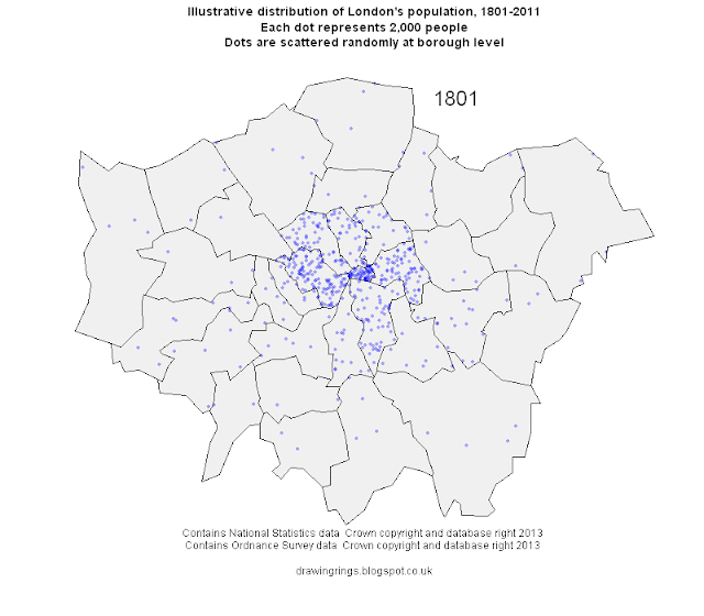
Over the last couple of hundred years London's population has grown and spread out on a vast scale. This process has involved a remarkable deconcentration of population from the centre to the suburbs: in 1801 the vast majority of its million people were crammed into a few central boroughs, with the square mile of the City of London holding 129,000 people. The population of the city grew by more than 5 million over the next century with the vast majority of that growth in the inner suburbs opened up by public transport. Over the course of the 20th century suburbanisation accelerated with the advent of the car, only for population growth to pick up again in the centre in the last few decades.
Summing up all this change in a single graphic is quite a challenge, so instead I've made this simple animated map, illustrating the changes in population using a dot-density approach where every dot represents 2,000 people. The dots are randomly distributed at borough level at the point of each Census starting in 1801 and ending in 2011, so they are
not meant to represent the exact locations of individual settlements.
The maps were made in
R using data from the Census (downloaded from the
London Datastore and updated with 2011 data) and boundaries from the Ordnance Survey. The animation was done in
UnFREEz as I couldn't get the native animation in R to work.
You might want to see:
ReplyDeletehttp://nexus.umn.edu/Movies-Full/Combined_London_UNR.mov
which does something similar.
-- David
That's a great video! Rail lines and everything. Thanks for the link, David.
ReplyDeleteInteresting to see City start off as the major population centre and eventually end up "deserted".
ReplyDelete